Sant’Anna comparative campaign
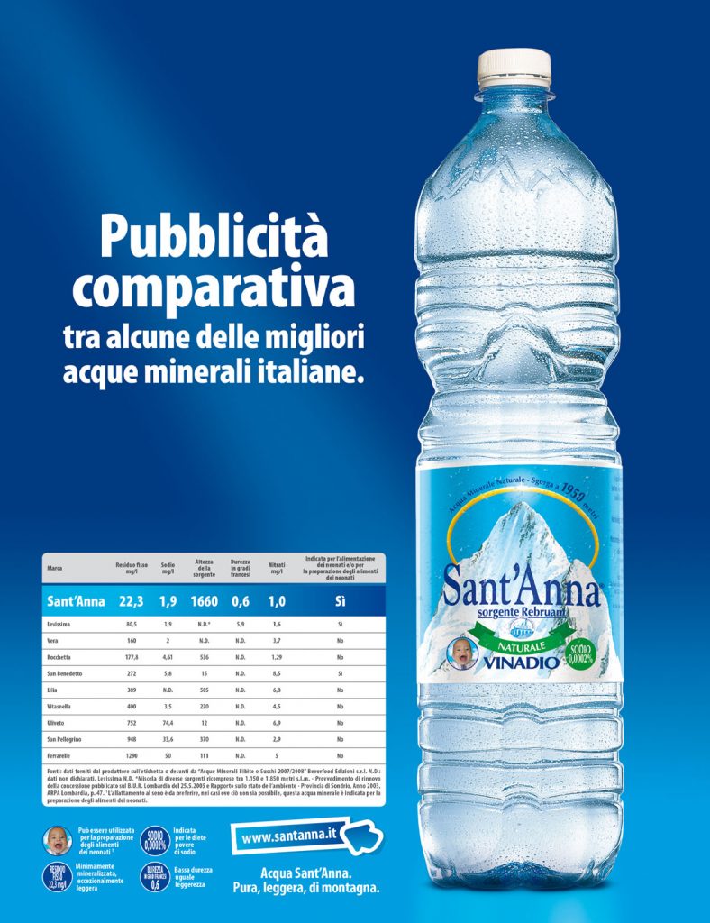
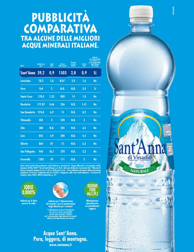
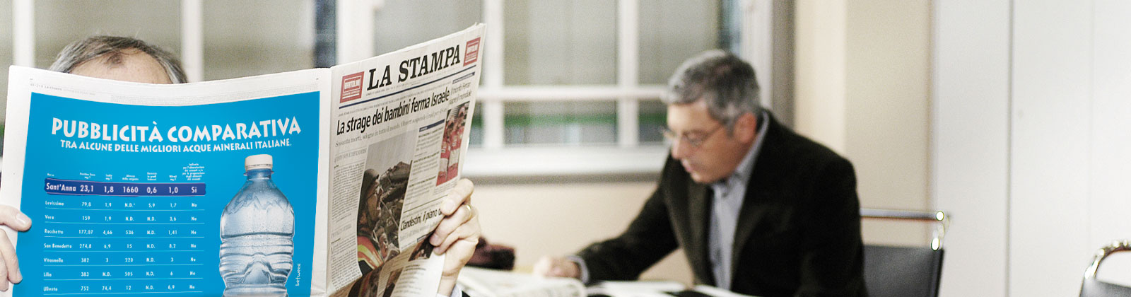
The comparative campaign signed by Between for Acqua Sant’Anna was a turning point for advertising communication in Italy for a reason as simple as it was crucial: the campaign was in fact the first real comparative that came out practically close to the decision to regulate the use of a comparison making it possible also in our country.
The striking appearance and the persistent presence of the campaign on the most important media (including radio and TV, including “Striscia la Notizia”) has created a completely new hype. For the simple fact that never before, in Italy, a brand had explicitly compared its product with those of the competition.


The outcry has not only involved the world of communication but also the institutions active in the matter. If on the one hand, in fact, many water-producing companies have openly contested the comparative formula of Sant’Anna interpreting it as a literally unprecedented threat, the same guarantor of communication has taken into consideration and assessed the extent and effects of a communication of this type, transforming it into a real reference benchmark (it is no coincidence, among other things, that the campaign has also become the subject of university studies and degree theses).
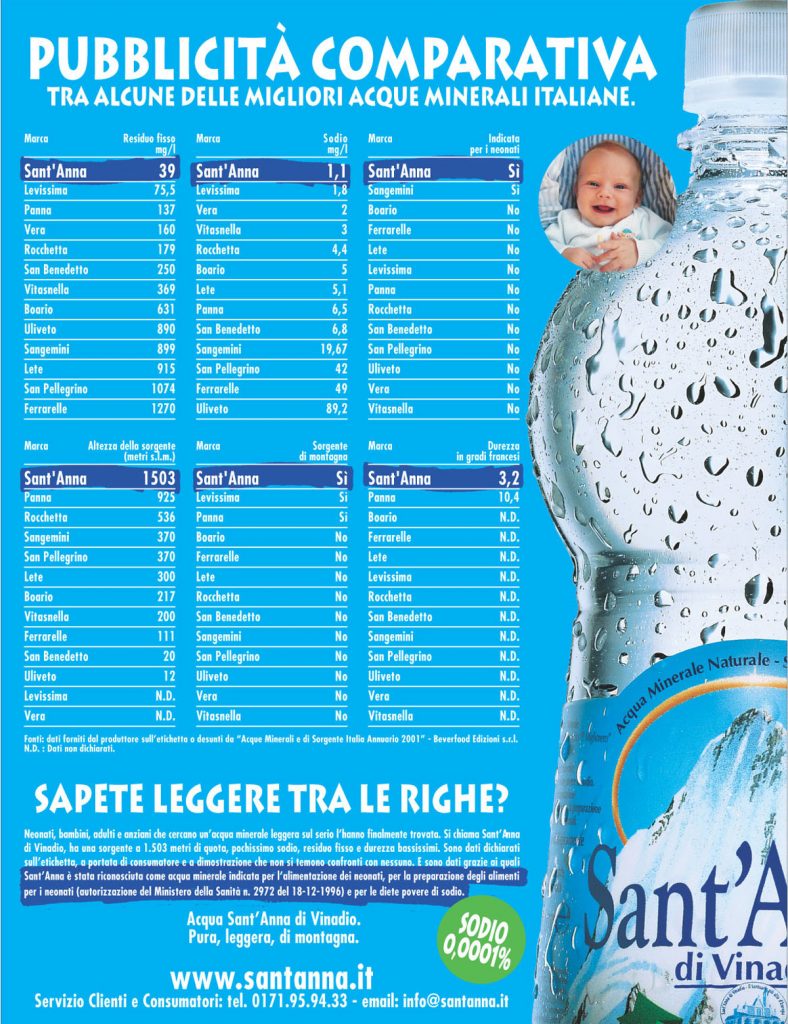
In addition to its precise communicative intention, which “educated” the market and redefined the information criteria of the product-water, making the target much more involved and aware, the campaign presented substantial innovations also in terms of graphic format and positioning of the product.
In fact, in the campaign, to represent the brand’s perfect recognisability with unequivocal clarity, the image of the bottle appears “cut”, distorting any canon or criterion that would like the logo to be always perfectly visible in its entirety. A visual approach that until then had taken root almost exclusively in the field of high-level fashion or design.
The same relevance also for another element of novelty, which has since become a constant: the sticker with the image of the newborn, which certifies the digestibility of water even for the most delicate organisms. A simple item to represent, together with everything else, a truly effective and innovative communication.