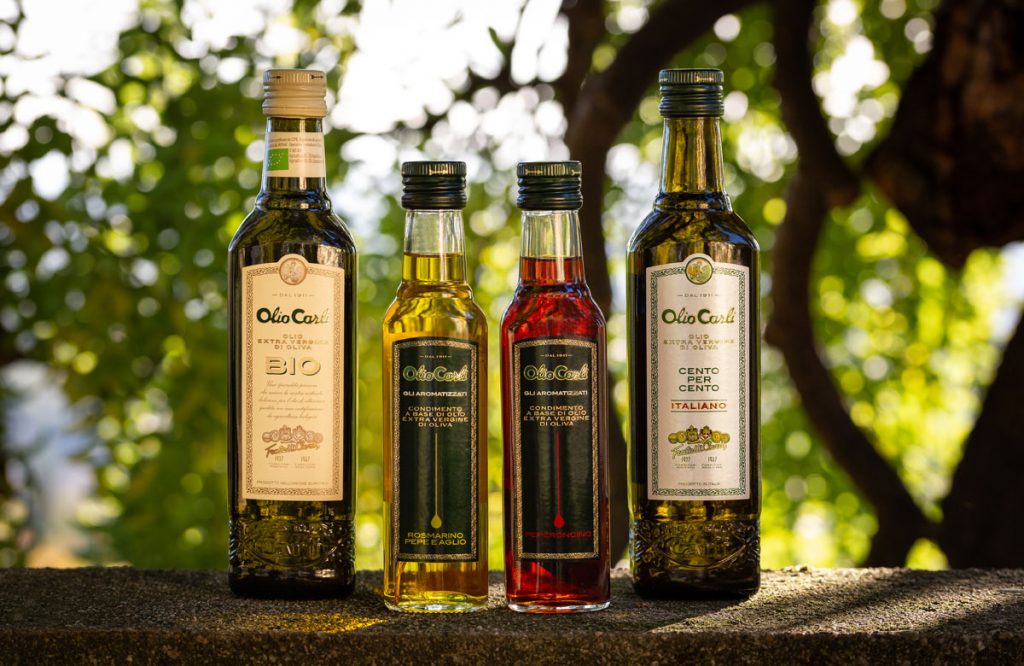
Fratelli Carli Three new arrivals in the Carli's home
Olio Carli launches three new lines aimed at the Italian and foreign market, Between thinks about their identity: naming, labels and packaging.
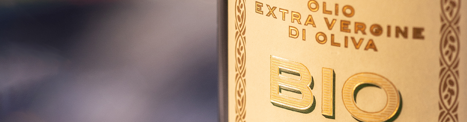
“BIO” has a rustic and inviting look and feel: the paper chosen for the labels is opaque and more rough to the touch than the other labels in the oil line, almost as if to recall the feeling of paper bags for bread. The “country” aspect of the paper, contrasts sharply with the word BIO, which is instead rich, structured and detailed. Just like the oil it represents.
“CENTO PER CENTO ITALIANO” has a classic and minimal character. Label and naming play on the colors of the Italian flag. Green recalls olive plants, red is passion (which also means dedication), while white spaces represent the purity of quality. A distinct and elegant style, typically Italian, enriched by the use of pearlescent paper.
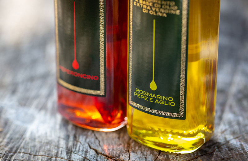
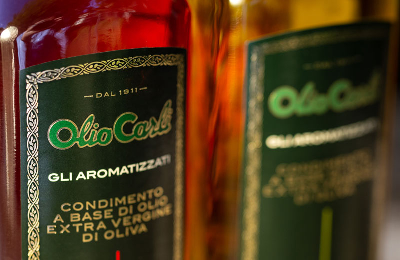
“GLI AROMATIZZATI” selection represents a new and distinctive note in Carli’s experience and tradition, to which a touch of modernity, beside traditional graphics, has been added . The labels are colored with new shades and an iconic element appears to represent the product line: a stylized drop.